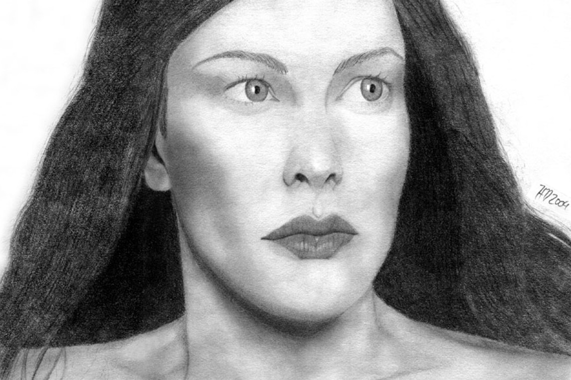
Edit: Darkened the shading around her eyes slightly and made a darker scan because the other one was rather light.
The portrait that got me launched into this drawing business was Arwen's Hope which I drew in the end of December 2003 (a little over 3 months ago ). I had done no reading on how to draw, I used a #2 pencil only and I drew it on sketch paper. And I was paranoid about the scanner being able to pick up pencil, so after I was done I actually went over the outlines of everything even darker... Considering all these things, I am quite happy with the first version of Arwen's hope. I think that the placement and shape of the features are pretty good. (It does, after all, look like Arwen) But I felt that she deserved better. I've improved so much since that portrait that I felt a should do a new one but at the skill level I am at now. So, here it is!
Here is a link to the original Arwen's Hope [link] (you can see the truly crappy nature of the paper...) and here is one to the reference [link] (#62)
About this drawing, the lips gave me a bit of trouble in the beginning stages of the sketch, what with having to make sure one side is shorter and all to get the proper perspective... I think I fixed it And in the reference, there is barely any detail to be seen in the hair, so I did not try to add detail in that might have ended up looking fake... I had to create the top of her head, after all, I felt that was enough creativity And it's too huge for my scanner! waanh I think I did an ok job of disguising the line with that neato clone tool... And I left the tears out on purpose. It's supposed to be showing the emotion Hope, not Sadness!
This will be the last LOTR drawing until the Extended DVD comes out. Next I'm doing a Star Wars series I hope I don't lose my watchers' interests
Very beautiful! I can really see the hope and not the sadness! Much improved from the original (cruddy paper can be a pain, can't it?)
The only thing is, and like you stated, the hair. It does look a tad fake. .perhaps if you added mor highlights and such, though I completely understand the situation of making up the top. I had to do the same.
Well, I don't know how I could add highlights that weren't there... I wouldn't have the slightest idea what I was doing. I mean, have you seen my Frodo? I totally made up his hair, and I had no idea where to put highlights and stuff. I'm just not very good at that kind of thing
I don't think you did that bad of a job on Frodo. . you were getting the right idea. Have it lighter when it curves out and shadow after. . .I guess with Arwen, you could add I slight contrast on top, or make the shading all dark and not worry about defining the strands....and I think I will shut-up now because I don't know what I am talking about. .
THis is great Heather! Its really amazing looking at the 2 drawings side by side. You've really grown a lot as an artist in just 3 months. You're rapidly getting a better handle of proportioning, shading and structure. The eyes and the lips look great in this new drawing. You should be really proud Heather!
Thanks for posting that link. Actually found some refs for characters I haven't been able to find good ones of. Maybe now I can finally draw a Faramir picture. Just need to find a few good Haldir pics now...
I'm looking forward to the upcoming Star Wars DVD set (gonna be asking for it for my birthday since it comes out a week or 2 before) and I'll definitly be looking forward to seeing you draw some of the SW characters.
Wow! Such an improvement in so short a time! Kuddo's to you!!! You can give you a nice pat on the back...
Very good likeness in this picture! Your shading is very soft and smooth on the neck area... very nice also... Her eyes are fair and clear and her lips showing lovely details...
What I notice was thoses smalls points... About the hairs : Your source of light is to the right and a bit higher than the eyes, so if you wish to add hightlights in the hairs it would be on the right side, on the top of her head left and right and slightly framing her face to the left.
There is also the eyesbrows, they are usually as dark as the hair, so yours should be a bit darker to fit the shade of the hair.
And finally, the little space between eyes lashes and the folding lines on the eyelid should be darker also, cause they are usually in a shadowy zone and the eyes lashes often cover most of it...
I hope I haven't scarred you.... These littles points doesn't change the fact that you did an very nice piece of work... keep it up!!!!
--
All colours are the friends of their neighbours and the lovers of their opposites. - Marc Chagall
Below we have compiled a list of 101 tips to help you improve your photography. You may know some of them already but were confident that you'll find at least a few gems in there! Go get yourself a cup of coffee and make sure you are sitting comfortably!
Spencer Kelly visits the Royal Albert Hall to see a digital graffiti wall where you can virtual spray paint to your heart's content and email the results to yourself.
Daily Literature Deviations is a group that is dedicated to bringing literature to the forefront of the deviantArt community. We attempt to accomplish this by daily featuring Literature artists from around the community that deserve the recognition, but are not getting it.
Each day we will feature 10 deviations from the Literature categories in a News Article. In order to support the artists that we feature, we ask that you the news article as well as check out the individual pieces. We understand that each day you may not be able to check out each and every one of the pieces, everyone has their own things going on. We just ask that you make an attempt to help support the growing Literature community.
When it comes to community spirit, `Rushy is a shining example. From participating in devmeets, to providing positive encouragement to other artists, `Rushy can always be found demonstrating what it really takes to be a true deviant. It's without any hesitation that we are delighted to award the Deviousness Award for July 2009 to `RushyRead More
Devious Comments
Comments
The only thing is, and like you stated, the hair. It does look a tad fake. .perhaps if you added mor highlights and such, though I completely understand the situation of making up the top. I had to do the same.
Good job though!
Thank you very much!
i really envy your skills
No problem!
Thanks for posting that link. Actually found some refs for characters I haven't been able to find good ones of. Maybe now I can finally draw a Faramir picture.
I'm looking forward to the upcoming Star Wars DVD set (gonna be asking for it for my birthday since it comes out a week or 2 before) and I'll definitly be looking forward to seeing you draw some of the SW characters.
--
my gallery
--
Roy from FMA is my hero.
as is HIROKI AIBA from tenimyu/Brights
kiriban: 12345 screenshot please
Very good likeness in this picture! Your shading is very soft and smooth on the neck area... very nice also... Her eyes are fair and clear and her lips showing lovely details...
What I notice was thoses smalls points... About the hairs : Your source of light is to the right and a bit higher than the eyes, so if you wish to add hightlights in the hairs it would be on the right side, on the top of her head left and right and slightly framing her face to the left.
There is also the eyesbrows, they are usually as dark as the hair, so yours should be a bit darker to fit the shade of the hair.
And finally, the little space between eyes lashes and the folding lines on the eyelid should be darker also, cause they are usually in a shadowy zone and the eyes lashes often cover most of it...
I hope I haven't scarred you.... These littles points doesn't change the fact that you did an very nice piece of work... keep it up!!!!
--
All colours are the friends of their neighbours and the lovers of their opposites. - Marc Chagall
Previous Page12345...Next Page